AWD-02 CSS3
On This Page
CSS
- Cascading Style Sheet (CSS) is used to set the style in web pages that contain HTML elements.
- With CSS, you can control the color, font, and the size of text, the spacing between elements, how elements are positioned and laid out, what background images or background colors are to be used, different displays for different devices and screen sizes, and much more!
- Without CSS, your website will appear as a plain HTML page.
- CSS can be added to HTML documents in 3 ways:
- Inline - by using the style attribute inside HTML elements.
- Internal - by using a
<style>element in the<head>section. - External - by using a
<link>element to link to an external CSS file.
Inline CSS:
- Inline CSS contains the CSS property in the body section attached to the element is known as inline CSS.
- An inline CSS uses the style attribute of an HTML element.
- This kind of style is specified within an HTML tag using the style attribute.
<h1 style="color:blue;">A Blue Heading</h1>
<p style="color:red; font-size:20px;">A red paragraph.</p>Internal CSS:
- This CSS style is an effective method of styling a single page.
- An internal CSS is defined in the
<head>section of an HTML page, within<style>element.
<head>
<style>
body {
background-color: powderblue;
}
h1 {
color: blue;
}
p {
color: red;
}
</style>
</head>External CSS:
- External CSS contains separate CSS files that contain only style properties with the help of tag attributes.
- CSS property is written in a separate file with a
.cssextension and should be linked to the HTML document using a<link>tag. - It means that, for each element, style can be set only once and will be applied across web pages.
<head>
<link rel="stylesheet" href="style.css" />
</head>body {
background-color: powderblue;
}
h1 {
color: blue;
}
p {
color: red;
}CSS Selectors
CSS selectors are used to "find" (or select) the HTML elements you want to style.
CSS Element Selector:
- The element selector selects HTML elements based on the element name.
<!DOCTYPE html>
<html>
<head>
<style>
p {
text-align: center;
color: red;
}
</style>
</head>
<body>
<p>Every paragraph will be affected by the style.</p>
<p id="para1">Me too!</p>
<p>And me!</p>
</body>
</html>CSS ID Selector:
- The id selector uses the id attribute of an HTML element to select a specific element.
- The id of an element is unique within a page, so the id selector is used to select one unique element!
- To select an element with a specific id, write a hash (#) character, followed by the id of the element.
<!DOCTYPE html>
<html>
<head>
<style>
#para1 {
text-align: center;
color: red;
}
</style>
</head>
<body>
<p id="para1">Hello World!</p>
<p>This paragraph is not affected by the style.</p>
</body>
</html>CSS Class Selector:
- The class selector selects HTML elements with a specific class attribute.
- To select elements with a specific class, write a period (.) character, followed by the class name.
<!DOCTYPE html>
<html>
<head>
<style>
.center {
text-align: center;
color: red;
}
</style>
</head>
<body>
<h1 class="center">Red and center-aligned heading</h1>
<p class="center">Red and center-aligned paragraph.</p>
</body>
</html>CSS Universal Selector:
- The universal selector (*) selects all HTML elements on the page.
/* Universal Selector */
* {
text-align: center;
color: blue;
}CSS Colors
- The
colorproperty specifies the text color of an element.
<!DOCTYPE html>
<html>
<body>
<h3 style="color:Red;">Hello World</h3>
<p style="color:Blue;">Lorem ipsum dolor sit</p>
<p style="color:Green;">Ut wisi enim ad minim veniam</p>
</body>
</html>CSS Background
CSS Background Color:
- The
background-colorproperty specifies the background color of an element.
body {
background-color: lightblue;
}CSS Background Image:
- The
background-imageproperty specifies an image to use as the background of an element. By default, the image is repeated so it covers the entire element.
body {
background-image: url("bgimg.jpg");
}CSS Background Repeat:
- By default, the background-image property repeats an image both horizontally and vertically.
- Some images should be repeated only horizontally or vertically, or they will look strange
body {
background-image: url("bgimg.png");
background-repeat: no-repeat; /* Not Repeated */
background-repeat: repeat-x; /* Repeated Horizontally */
background-repeat: repeat-y; /* Repeated Vertically */
}CSS Background Position:
- The
background-positionproperty is used to specify the position of the background image.
body {
background-image: url("bgimg.png");
background-repeat: no-repeat;
background-position: right top;
}CSS Background Attachment:
- The
background-attachmentproperty specifies whether the background image should scroll or be fixed (will not scroll with the rest of the page)
body {
background-image: url("bgimg.png");
background-repeat: no-repeat;
background-position: right top;
background-attachment: fixed;
}CSS Opacity / Transparency
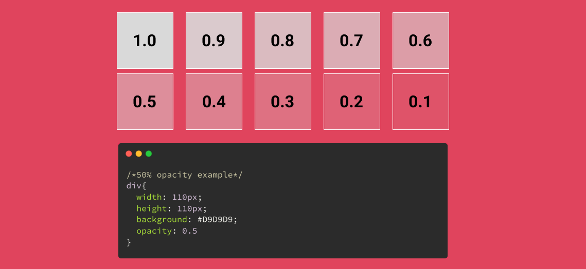
- The
opacityproperty specifies the opacity/transparency of an element. - It can take a value from
0.0-1.0. The lower value, the more transparent
CSS Borders
CSS Border Style:
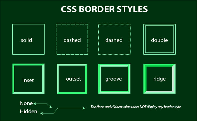
- The
border-styleproperty specifies what kind of border to display dotted- Defines a dotted borderdashed- Defines a dashed bordersolid- Defines a solid borderdouble- Defines a double bordergroove- Defines a 3D grooved border. The effect depends on the border-color valueridge- Defines a 3D ridged border. The effect depends on the border-color valueinset- Defines a 3D inset border. The effect depends on the border-color valueoutset- Defines a 3D outset border. The effect depends on the border-color valuenone- Defines no borderhidden- Defines a hidden border
.box {
border-style: solid;
}CSS Border Color:
- The
border-colorproperty is used to set the color of the four borders.
.box {
border-style: solid;
border-color: green;
}CSS Border Width:
- The
border-widthproperty specifies the width of the four borders. - The width can be set as a specific size (in px, pt, cm, em, etc) or by using one of the three pre-defined values: thin, medium, or thick
.box {
border-style: solid;
border-color: green;
border-width: medium;
}CSS Rounded Borders:
- The
border-radiusproperty is used to add rounded borders to an element
.box {
border-style: solid;
border-color: green;
border-width: medium;
border-radius: 5px;
}CSS Margin
- The CSS
marginproperties are used to create space around elements, outside of any defined borders. - CSS has properties for specifying the margin for each side of an element:
margin-topmargin-rightmargin-bottommargin-left
- All the margin properties can have the following values:
auto- the browser calculates the marginlength- specifies a margin in px, pt, cm, etc.%- specifies a margin in % of the width of the containing elementinherit- specifies that the margin should be inherited from the parent element
body{
margin: 5px;
}
div{
margin-top: 5px;
margin-right: 10px;
margin-bottom:7px;
margin-left: 10px;
}
h1{
margin: 5px 10px 7px 10px;
}
.box{
margin 10px 20px;
}CSS Padding
- The CSS
paddingproperties are used to generate space around an element's content, inside of any defined borders. - With CSS, you have full control over the padding. There are properties for setting the padding for each side of an element (top, right, bottom, and left).
- CSS has properties for specifying the padding for each side of an element:
padding-toppadding-rightpadding-bottompadding-left
- All the padding properties can have the following values:
length- specifies a padding in px, pt, cm, etc.%- specifies a padding in % of the width of the containing elementinherit- specifies that the padding should be inherited from the parent element
body{
padding: 5px;
}
div{
padding-top: 5px;
padding-right: 10px;
padding-bottom:7px;
padding-left: 10px;
}
h1{
padding: 5px 10px 7px 10px;
}
.box{
padding 10px 20px;
}CSS Height, Width and Max-Width
- The CSS
heightandwidthproperties are used to set the height and width of an element. - The CSS
max-widthproperty is used to set the maximum width of an element. - The height and width properties may have the following values:
auto- This is default. The browser calculates the height and widthlength- Defines the height/width in px, cm, etc.%- Defines the height/width in percent of the containing blockinitial- Sets the height/width to its default valueinherit- The height/width will be inherited from its parent value
body {
height: 200px;
max-width: 70%;
}
div {
height: 200px;
width: 50%;
background-color: powderblue;
}CSS Box Model
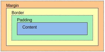
- In CSS, the term "box model" is used when talking about design and layout. The CSS box model is essentially a box that wraps around every HTML element.
- The box model allows us to add a border around elements, and to define space between elements.
- It consists of: content, padding, borders and margins.
- Content - The content of the box, where text and images appear
- Padding - Clears an area around the content. The padding is transparent
- Border - A border that goes around the padding and content
- Margin - Clears an area outside the border. The margin is transparent
div {
background-color: lightgrey;
width: 300px;
border: 15px solid green;
padding: 50px;
margin: 20px;
}CSS Text Properties
Text Color & Background Color:
body {
background-color: lightgrey;
color: blue;
}
h1 {
background-color: black;
color: green;
}Text Alignment & Text Direction:
- The
text-alignproperty is used to set the horizontal alignment of a text. A text can beleftorrightaligned,centered, orjustified. - The
directionproperty specifies the text direction/writing direction. It can bertl(right to left) orltr(left to right)
h1 {
text-align: center;
direction: rtl;
}
h2 {
text-align: left;
}
h3 {
text-align: right;
}Text Decoration:
- The text-decoration property is a shorthand property for:
text-decoration-line(required)text-decoration-color(optional)text-decoration-style(optional)text-decoration-thickness(optional)
Text Transformation:
- The
text-transformproperty is used to specify uppercase and lowercase letters in a text. - It can be used to turn everything into
uppercaseorlowercaseletters, orcapitalizethe first letter of each word:
p.uppercase {
text-transform: uppercase;
}
p.lowercase {
text-transform: lowercase;
}
p.capitalize {
text-transform: capitalize;
}Text Spacing:
- The
text-indentproperty is used to specify the indentation of the first line of a text - The
letter-spacingproperty is used to specify the space between the characters in a text. - The
line-heightproperty is used to specify the space between lines. - The
word-spacingproperty is used to specify the space between the words in a text. - The
white-spaceproperty specifies how white-space inside an element is handled.
p {
text-indent: 50px;
letter-spacing: 5px;
line-height: 0.7;
word-spacing: 10px;
white-space: nowrap;
}Text Shadow:
- The
text-shadowproperty adds shadow to text.
h1 {
text-shadow: 2px 2px;
}CSS Fonts
- In CSS, we use the
font-familyproperty to specify the font of a text. - The
font-styleproperty is mostly used to specify italic text - The
font-weightproperty specifies the weight of a font: - The
font-sizeproperty sets the size of the text.- The font-size value can be an absolute, or relative size.
- Absolute size:
- Sets the text to a specified size
- Does not allow a user to change the text size in all browsers (bad for accessibility reasons)
- Absolute size is useful when the physical size of the output is known
- Relative size:
- Sets the size relative to surrounding elements
- Allows a user to change the text size in browsers
div {
font-family: "Lucida Console", "Courier New", monospace;
font-style: italic;
font-weight: lighter;
font-size: 14px;
}CSS List Properties
- The CSS list properties allow you to:
- Set different list item markers for ordered lists
- Set different list item markers for unordered lists
- Set an image as the list item marker
- Add background colors to lists and list items
- The
list-style-typeproperty specifies the type of list item marker.
ul {
list-style-type: circle;
}CSS Display Properties
- The
displayproperty is used to specify how an element is shown on a web page. - Every HTML element has a default display value, depending on what type of element it is.
Block-level Elements:
- A block-level element ALWAYS starts on a new line and takes up the full width available (stretches out to the left and right as far as it can)
- Examples of block-level elements:
<div><h1>to<h6><p><form><header><footer><section>
Inline Elements:
- An inline element DOES NOT start on a new line and only takes up as much width as necessary.
- Examples of inline elements:
<span><a><img>
Display Property Values:
| Value | Description |
|---|---|
| inline | Displays an element as an inline element (like <span>). Any height and width properties will have no effect. This is default. |
| block | Displays an element as a block element (like <p>). It starts on a new line, and takes up the whole width |
| contents | Makes the container disappear, making the child elements children of the element the next level up in the DOM |
| flex | Displays an element as a block-level flex container |
| grid | Displays an element as a block-level grid container |
| inline-block | Displays an element as an inline-level block container. The element itself is formatted as an inline element, but you can apply height and width values |
| inline-flex | Displays an element as an inline-level flex container |
| inline-grid | Displays an element as an inline-level grid container |
| inline-table | The element is displayed as an inline-level table |
| list-item | Let the element behave like a <li> element |
| run-in | Displays an element as either block or inline, depending on context |
| table | Let the element behave like a <table> element |
| table-caption | Let the element behave like a <caption> element |
| table-column-group | Let the element behave like a <colgroup> element |
| table-header-group | Let the element behave like a <thead> element |
| table-footer-group | Let the element behave like a <tfoot> element |
| table-row-group | Let the element behave like a <tbody> element |
| table-cell | Let the element behave like a <td> element |
| table-column | Let the element behave like a <col> element |
| table-row | Let the element behave like a <tr> element |
| none | The element is completely removed |
| initial | Sets this property to its default value. Read about initial |
| inherit | Inherits this property from its parent element. Read about inherit |
CSS Layout Properties
-
The
positionproperty specifies the type of positioning method used for an element. -
There are five different position values:
static- HTML elements are positioned static by default.
- Static positioned elements are not affected by the top, bottom, left, and right properties.
- An element with
position: static;is not positioned in any special way; it is always positioned according to the normal flow of the page
relative- An element with
position: relative;is positioned relative to its normal position. - Setting the top, right, bottom, and left properties of a relatively-positioned element will cause it to be adjusted away from its normal position.
- Other content will not be adjusted to fit into any gap left by the element.
- An element with
fixed- An element with
position: fixed;is positioned relative to the viewport, which means it always stays in the same place even if the page is scrolled. - The top, right, bottom, and left properties are used to position the element.
- A fixed element does not leave a gap in the page where it would normally have been located.
- An element with
absolute- An element with
position: absolute;is positioned relative to the nearest positioned ancestor (instead of positioned relative to the viewport, like fixed). - However; if an absolute positioned element has no positioned ancestors, it uses the document body, and moves along with page scrolling.
- Note: Absolute positioned elements are removed from the normal flow, and can overlap elements.
- An element with
sticky- An element with
position: sticky;is positioned based on the user's scroll position. - A sticky element toggles between relative and fixed, depending on the scroll position.
- It is positioned relative until a given offset position is met in the viewport - then it "sticks" in place (like
position:fixed).
- An element with
-
Elements are then positioned using the top, bottom, left, and right properties. However, these properties will not work unless the position property is set first. They also work differently depending on the position value.
Z-Index Property
- When elements are positioned, they can overlap other elements.
- The
z-indexproperty specifies the stack order of an element (which element should be placed in front of, or behind, the others). - An element can have a positive or negative stack order
img {
position: absolute;
left: 0px;
top: 0px;
z-index: -1;
}
h1 {
z-index: 1;
}Overflow Property
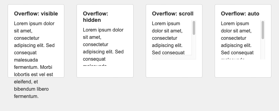
- The
overflowproperty specifies whether to clip the content or to add scrollbars when the content of an element is too big to fit in the specified area. - The
overflowproperty has the following values:visible- Default. The overflow is not clipped. The content renders outside the element's boxhidden- The overflow is clipped, and the rest of the content will be invisiblescroll- The overflow is clipped, and a scrollbar is added to see the rest of the contentauto- Similar to scroll, but it adds scrollbars only when necessary
div {
background-color: coral;
width: 200px;
height: 65px;
border: 1px solid;
overflow: visible;
}Transition Property
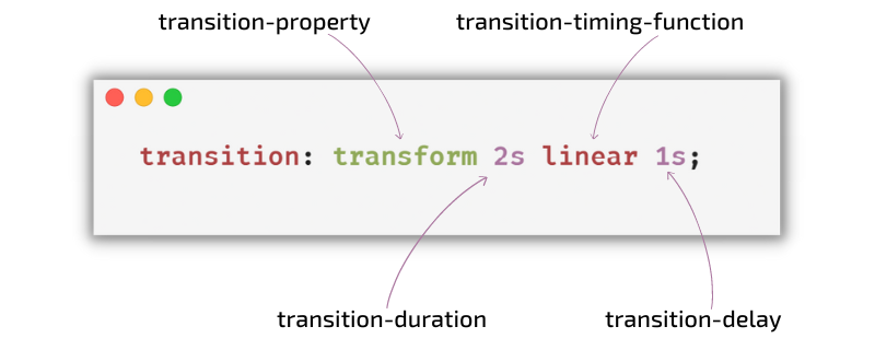
- CSS transitions allows you to change property values smoothly, over a given duration.
- To create a transition effect, you must specify two things:
- The CSS property you want to add an effect to
- The duration of the effect
- The
transition-timing-functionproperty specifies the speed curve of the transition effect. - The
transition-timing-functionproperty can have the following values:ease- specifies a transition effect with a slow start, then fast, then end slowly (this is default)linear- specifies a transition effect with the same speed from start to endease-in- specifies a transition effect with a slow startease-out- specifies a transition effect with a slow endease-in-out- specifies a transition effect with a slow start and endcubic-bezier(n,n,n,n)- lets you define your own values in a cubic-bezier function
- The
transition-delayproperty specifies a delay (in seconds) for the transition effect. - The
transition-durationproperty specifies how many seconds or milliseconds a transition effect takes to complete
div{
width: 100px;
height: 100px;
background: red;
transition: width 2s;
}
div:hover{
width: 300px;
}Animation Property
-
CSS allows animation of HTML elements without using JavaScript
-
An animation lets an element gradually change from one style to another.
-
You can change as many CSS properties you want, as many times as you want.
-
To use CSS animation, you must first specify some keyframes for the animation.
-
Keyframes hold what styles the element will have at certain times.
-
When you specify CSS styles inside the
@keyframesrule, the animation will gradually change from the current style to the new style at certain times. -
To get an animation to work, you must bind the animation to an element.
div {
width: 100px;
height: 100px;
background-color: red;
animation-name: example;
animation-duration: 4s;
}
@keyframes example {
from {
background-color: red;
}
to {
background-color: yellow;
}
}- The
animation-directionproperty specifies whether an animation should be played forwards, backwards or in alternate cycles. - The
animation-directionproperty can have the following values:normal- The animation is played as normal (forwards). This is defaultreverse- The animation is played in reverse direction (backwards)alternate- The animation is played forwards first, then backwardsalternate-reverse - The animation is played backwards first, then forwards
div {
width: 100px;
height: 100px;
background-color: red;
position: relative;
animation-name: example;
animation-duration: 4s;
animation-direction: reverse;
}
@keyframes example {
0% {
background-color: red;
left: 0px;
top: 0px;
}
25% {
background-color: yellow;
left: 200px;
top: 0px;
}
50% {
background-color: blue;
left: 200px;
top: 200px;
}
75% {
background-color: green;
left: 0px;
top: 200px;
}
100% {
background-color: red;
left: 0px;
top: 0px;
}
}- The
animation-timing-functionproperty specifies the speed curve of the animation. - The
animation-timing-functionproperty can have the following values:ease- Specifies an animation with a slow start, then fast, then end slowly (this is default)linear- Specifies an animation with the same speed from start to endease-in- Specifies an animation with a slow start ease-out - Specifies an animation with a slow endease-in-out- Specifies an animation with a slow start and endcubic-bezier(n,n,n,n)- Lets you define your own values in a cubic-bezier function
Media Queries
- Media query is a CSS technique introduced in CSS3.
- It uses the
@mediarule to include a block of CSS properties only if a certain condition is true.
@media only screen and (max-width: 600px){
body {
background-color: lightblue;
}
}Questions
- What are CSS selectors, and how are they used to style HTML elements?
- How can backgrounds and background properties be manipulated using CSS? Provide examples.
- Discuss the different types of borders that can be applied to elements using CSS.
- What are transitions and animations in CSS?
- Explain the concept of Flexbox in CSS and how it simplifies the creation of flexible layouts.
- Describe the Grid Layout system in CSS and compare it with Flexbox
- What are media queries, and how are they used to create responsive web designs?
- Discuss the importance of fonts in web design and how CSS is used to manipulate them.
- Describe the CSS text properties and their effects on text styling