Flutter-03 Layouts
On This Page
Type of Layout Widgets
Single Child Widgets
Single Child Widgets are those that can contain only one child. These widgets are used to modify or control the behavior of a single widget
- Container: A versatile widget that can be used for layout, styling, and positioning. Can have padding, margin, borders, and background colors.
Container(
padding: EdgeInsets.all(16.0),
margin: EdgeInsets.all(8.0),
color: Colors.blue,
child: Text('Single Child Widget'),
);- Padding : Adds padding around a child widget
Padding(
padding: EdgeInsets.all(16.0),
child: Text('Padded Text'),
);- Align : Aligns a child widget within its parent.
Align(
alignment: Alignment.center,
child: Text('Centered Text'),
);- Center : Centers its child widget within the parent.
Center(
child: Text('Centered Text'),
);- SizedBox : Provides a box with a specific size.
SizedBox(
width: 100,
height: 100,
child: Text('Sized Box'),
);- Expanded : Expands a child widget to fill available space in the parent
Expanded(
child: Text('Expanded Text'),
);Multiple Child Widgets
Multiple Child Widgets can contain more than one child. These widgets are often used to create complex layouts by arranging multiple widgets in a specific order or alignment.
- Column : Arranges its children in a vertical direction.
Column(
children: <Widget>[
Text('First'),
Text('Second'),
Text('Third'),
],
);- Row : Arranges its children in a horizontal direction.
Row(
children: <Widget>[
Icon(Icons.star),
Icon(Icons.star),
Icon(Icons.star),
],
);- Stack : Places its children on top of each other, allowing for overlap.
Stack(
children: <Widget>[
Container(
width: 100,
height: 100,
color: Colors.red,
),
Positioned(
top: 20,
left: 20,
child: Container(
width: 50,
height: 50,
color: Colors.blue,
),
),
],
);- ListView : A scrollable list of widgets arranged in a linear fashion (either vertical or horizontal).
ListView(
children: <Widget>[
ListTile(title: Text('Item 1')),
ListTile(title: Text('Item 2')),
ListTile(title: Text('Item 3')),
],
);- GridView : A scrollable, 2D array of widgets arranged in rows and columns.
GridView.count(
crossAxisCount: 2,
children: <Widget>[
Container(color: Colors.red, height: 100),
Container(color: Colors.blue, height: 100),
Container(color: Colors.green, height: 100),
Container(color: Colors.yellow, height: 100),
],
);- Wrap : Wraps its children into a vertical or horizontal flow, breaking lines as necessary.
Wrap(
spacing: 8.0,
runSpacing: 4.0,
children: <Widget>[
Chip(label: Text('Chip 1')),
Chip(label: Text('Chip 2')),
Chip(label: Text('Chip 3')),
],
);- Flex : A widget that arranges its children in a one-dimensional array (similar to Row and Column but more customizable).
Flex(
direction: Axis.horizontal,
children: <Widget>[
Expanded(child: Container(color: Colors.red, height:
50)),
Expanded(child: Container(color: Colors.blue, heigh
t: 50)),
],
);Conclusion
- Single Child Widgets are used when you need to modify or layout a single widget.
- Multiple Child Widgets are used for more complex layouts that involve arranging multiple widgets in different patterns or directions.
Advanced Layout Application
In this section, let us learn how to create a complex user interface of product listing with custom design using both single and multiple child layout widgets.
For this purpose, follow the sequence given below:
- Create a new Flutter application in VS Code, store_app.
- Replace the main.dart code with following code:
import 'package:flutter/material.dart';
void main() => runApp(MyApp());
class MyApp extends StatelessWidget {
@override
Widget build(BuildContext context) {
return MaterialApp(
title: 'Flutter Demo',
theme: ThemeData(
primarySwatch: Colors.blue,
),
home: MyHomePage(title: 'Product layout demo home page'),
);
}
}- Here, We have created MyHomePage widget by extending StatelessWidget instead of default StatefulWidget and then removed the relevant code.
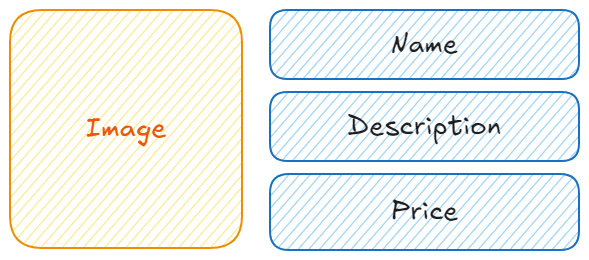
- Now, create a new widget, ProductBox according to the specified design as shown below
import 'package:flutter/material.dart';
class ProductBox extends StatelessWidget {
const ProductBox({
Key? key,
this.name = '',
this.description = '',
this.price = 0,
this.image = '',
}) : super(key: key);
final String name;
final String description;
final int price;
final String image;
@override
Widget build(BuildContext context) {
return Container(
padding: const EdgeInsets.all(2),
height: 120,
child: Card(
child: Row(
mainAxisAlignment: MainAxisAlignment.spaceEvenly,
children: <Widget>[
Image.asset(
'assets/appimages/' + image,
width: 100, // Adjust width as needed
height: 100, // Adjust height as needed
fit: BoxFit.cover, // Adjust BoxFit as needed
),
Expanded(
child: Container(
padding: const EdgeInsets.all(5),
child: Column(
mainAxisAlignment: MainAxisAlignment.spaceEvenly,
crossAxisAlignment: CrossAxisAlignment.start,
children: <Widget>[
Text(
name,
style: const TextStyle(fontWeight: FontWeight.bold),
),
Text(
description,
maxLines: 2, // Adjust as needed
overflow: TextOverflow.ellipsis,
),
Text(
'Price: \$${price.toString()}',
style: TextStyle(fontWeight: FontWeight.bold),
),
],
),
),
),
],
),
),
);
}
}- Please observe the following in the code:
- ProductBox has used four arguments as specified below:
- name - Product name
- description - Product description
- price - Price of the product
- image - Image of the product
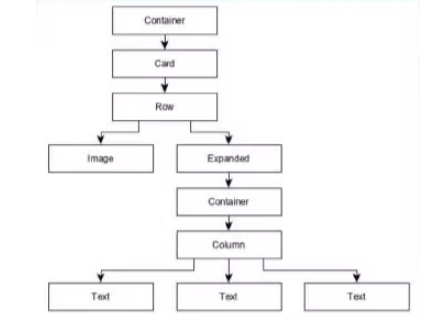
- ProductBox uses seven build-in widgets as specified below:
- Container Expanded Row Column Card Text
- ProductBox has used four arguments as specified below:
- ProductBox is designed using the above mentioned widget. The arrangement or hierarchy of the widget is specified in the diagram shown below
- Now, place some dummy image (see below) for product information in the assets folder of the application and configure the assets folder in the pubspec.yaml file as shown below
- Definition images in pubspec.yam
- Finally, Use the ProductBox widget in the MyHomePage widget as specified below:
import 'package:flutter/material.dart';
class MyHomePage extends StatelessWidget {
const MyHomePage({super.key, this.title = ''});
final String title;
@override
Widget build(BuildContext context) {
return Scaffold(
appBar: AppBar(title: const Text("Product Listing")),
body: ListView(
shrinkWrap: true,
padding: const EdgeInsets.fromLTRB(2.0, 10.0, 2.0, 10.0),
children: <Widget>[
ProductBox(
name: "iPhone",
description: "iPhone is the stylist phone ever",
price: 1000,
image: "iPhone.jpg"),
ProductBox(
name: "Pixel",
description: "Pixel is the most featureful phone ever",
price: 800,
image: "pixel.png"),
ProductBox(
name: "Laptop",
description: "Laptop is most productive development tool",
price: 2000,
image: "laptop.jpg"),
ProductBox(
name: "Tablet",
description: "Tablet is the most useful device ever for meeting",
price: 1500,
image: "tablet.jpg"),
ProductBox(
name: "Floppy Drive",
description: "Floppy drive is useful rescue storage medium",
price: 20,
image: "floppy.jpg"),
],
),
);
}
}- Here,we have used ProductBox as children of ListView widget.
- The complete code (main.dart) of the product layout application (store_app) is as follows:
import 'package:flutter/material.dart';
class MyHomePage extends StatelessWidget {
const MyHomePage({super.key, this.title = ''});
final String title;
@override
Widget build(BuildContext context) {
return Scaffold(
appBar: AppBar(title: const Text("Product Listing")),
body: ListView(
shrinkWrap: true,
padding: const EdgeInsets.fromLTRB(2.0, 10.0, 2.0, 10.0),
children: const <Widget>[
ProductBox(
name: "iPhone",
description: "iPhone is the most stylish phone ever.",
price: 1000,
image: "iPhone.jpg",
),
ProductBox(
name: "Pixel",
description: "Pixel is the most featureful phone.",
price: 800,
image: "pixel.png",
),
ProductBox(
name: "Laptop",
description: "Laptop is the most productive development tool.",
price: 2000,
image: "laptop.jpg",
),
ProductBox(
name: "Tablet",
description: "Tablet is the most useful device for meetings.",
price: 1500,
image: "tablet.jpg",
),
ProductBox(
name: "Floppy Drive",
description: "Floppy drive is useful for rescue storage.",
price: 20,
image: "floppy.jpg",
),
],
),
);
}
}
class ProductBox extends StatelessWidget {
const ProductBox({
super.key,
this.name = '',
this.description = '',
this.price = 0,
this.image = '',
});
final String name;
final String description;
final int price;
final String image;
@override
Widget build(BuildContext context) {
return Container(
padding: const EdgeInsets.all(2),
height: 120,
child: Card(
child: Row(
mainAxisAlignment: MainAxisAlignment.spaceEvenly,
children: <Widget>[
Image.asset(
"assets/appimages/$image",
width: 100,
height: 100,
fit: BoxFit.cover,
),
Expanded(
child: Container(
padding: const EdgeInsets.all(5),
child: Column(
mainAxisAlignment: MainAxisAlignment.spaceEvenly,
crossAxisAlignment: CrossAxisAlignment.start,
children: <Widget>[
Text(
name,
style: const TextStyle(fontWeight: FontWeight.bold),
),
Text(
description,
maxLines: 2,
overflow: TextOverflow.ellipsis,
),
Text(
"Price: \$${price.toString()}",
style: const TextStyle(fontWeight: FontWeight.bold),
),
],
),
),
),
],
),
),
);
}
}Gestures
In Flutter, gestures are a way to detect and respond to user interactions like taps, swipes, and drags. Flutter provides a robust system to handle gestures, making it easy to create interactive and responsive user interfaces. The primary widget used for handling gestures in Flutter is the GestureDetector .
Key Concepts of Gestures
GestureDetector: TheGestureDetectorwidget is used to capture a wide range of gestures. It wraps around another widget and intercepts gestures like taps, double taps, long presses, swipes, and more.- Common Gestures:
- Tap: A single quick press.
- Double Tap: Two quick presses in succession.
- Long Press: A press that lasts for more than a second.
- Swipe: A quick drag motion in a particular direction.
- Drag: A press followed by movement.
- Using
GestureDetector: TheGestureDetectorwidget has properties likeonTap,onDoubleTap,onLongPress,onPanUpdate, and others, each corresponding to a specific gesture.
Example
Let's create a simple example where a container changes its color when the user taps on it
import 'package:flutter/material.dart';
void main() {
runApp(GestureExample());
}
class GestureExample extends StatefulWidget {
@override
_GestureExampleState createState() => _GestureExampleState();
}
class _GestureExampleState extends State<GestureExample> {
Color _color = Colors.blue;
void _changeColor() {
setState(() {
_color = _color == Colors.blue ? Colors.red : Colors.blue;
});
}
@override
Widget build(BuildContext context) {
return MaterialApp(
home: Scaffold(
appBar: AppBar(
title: Text('Gesture Example'),
),
body: Center(
child: GestureDetector(
onTap: _changeColor,
child: Container(
width: 200,
height: 200,
color: _color,
child: Center(
child: Text(
'Tap me',
style: TextStyle(color: Colors.white, fontSize: 24),
),
),
),
),
),
),
);
}
}- Here The
GestureDetectorwraps a Container widget. TheonTapcallback is used to change the color of the container when the user taps on it. - The
_changeColormethod is called when the container is tapped, toggling its color between blue and red.
Advanced Gestures
- Drag Gesture: You can detect dragging using the
onPanUpdatecallback. This is useful for interactive elements like sliders or custom scroll views.
GestureDetector(
onPanUpdate: (details) {
// Handle drag
},
child: Container(
color: Colors.green,
width: 200,
height: 200,
),
);- Swipe Gesture: Detecting swipes involves using
onHorizontalDragEndoronVerticalDragEndcallbacks. These are triggered when the user swipes in a particular direction.
dartCopy code
GestureDetector(
onHorizontalDragEnd: (details) {
// Handle horizontal swipe
},
child: Container(
color: Colors.orange,
width: 200,
height: 200,
),
);- Pinch and Zoom: For more advanced interactions like pinch-to-zoom, you would typically use the
onScaleUpdatecallback.
dartCopy code
GestureDetector(
onScaleUpdate: (details) {
// Handle pinch-to-zoom
},
child: Container(
color: Colors.purple,
width: 200,
height: 200,
),
);State Management in Flutter
- State management is a critical concept in Flutter that involves managing the state, or the data that your UI depends on.
- In Flutter, state refers to any data that can change over time, such as user input, the result of an asynchronous operation, or even the appearance of a widget.
- Flutter provides various ways to manage state, depending on the complexity and scope of the application.
- These methods can generally be categorised into Ephemeral State Management and Application State Management.
Ephemeral State Management
- Ephemeral state (also known as UI state or local state) is state that is local to a single widget.
- This type of state is usually simple and short-lived, like whether a checkbox is checked or the current page of a
PageView. -
Ephemeral state can be managed directly within the widget itself using the
Stateclass Example:
import 'package:flutter/material.dart';
void main() {
runApp(MyApp());
}
class MyApp extends StatelessWidget {
@override
Widget build(BuildContext context) {
return MaterialApp(
home: Scaffold(
appBar: AppBar(
title: Text('Ephemeral State Example'),
),
body: CounterWidget(),
),
);
}
}
class CounterWidget extends StatefulWidget {
@override
_CounterWidgetState createState() => _CounterWidgetState();
}
class _CounterWidgetState extends State<CounterWidget> {
int _counter = 0;
void _incrementCounter() {
setState(() {
_counter++;
});
}
@override
Widget build(BuildContext context) {
return Center(
child: Column(
mainAxisAlignment: MainAxisAlignment.center,
children: <Widget>[
Text(
'You have pushed the button this many times:',
),
Text('$_counter', style: Theme.of(context).textTheme.headline4),
ElevatedButton(
onPressed: _incrementCounter,
child: Text('Increment'),
),
],
),
);
}
}- In this example, the
_countervariable is managed within theCounterWidget's state class (_CounterWidgetState). - This state is ephemeral because it only affects the
CounterWidgetand is not needed elsewhere in the app. - When the button is pressed,
setStateis called, which tells Flutter to rebuild the widget with the updated state.
Application State Management
- Application state (also known as shared state or global state) refers to state that needs to be shared across multiple parts of the application.
- This kind of state can include user preferences, authentication status, or data fetched from an API that needs to be accessible throughout the app.
- Managing application state can be more complex because it often involves sharing data between different parts of the app.
- Flutter provides several approaches to managing application state, including
InheritedWidget,Provider,Bloc,Riverpod, and more.
Step 1: Define the App's State in a StatefulWidget
- You can use a
StatefulWidgetto hold the application state (in this case, a counter) and manage its changes.
import 'package:flutter/material.dart';
void main() => runApp(MyApp());
class MyApp extends StatefulWidget {
@override
_MyAppState createState() => _MyAppState();
}
class _MyAppState extends State<MyApp> {
int _counter = 0;
void _incrementCounter() {
setState(() {
_counter++;
});
}
@override
Widget build(BuildContext context) {
return MaterialApp(
title: 'App State Management',
theme: ThemeData(primarySwatch: Colors.blue),
home: HomeScreen(
counter: _counter,
incrementCounter: _incrementCounter,
),
);
}
}- Here,
_counteris our application-wide state. We have a function_incrementCounter()that updates the state.setState()is used to rebuild the widget tree when the state changes.
Step 2: Create the HomeScreen and Pass the State
- The
HomeScreenwidget will display the counter value and allow navigation to a second screen where the counter can be updated.
import 'package:flutter/material.dart';
class HomeScreen extends StatelessWidget {
final int counter;
final VoidCallback incrementCounter;
HomeScreen({
required this.counter,
required this.incrementCounter,
});
@override
Widget build(BuildContext context) {
return Scaffold(
appBar: AppBar(
title: const Text('Home Screen'),
),
body: Center(
child: Column(
mainAxisAlignment: MainAxisAlignment.center,
children: <Widget>[
const Text(
'Counter value:',
style: TextStyle(fontSize: 20),
),
Text(
'$counter',
style: Theme.of(context).textTheme.headline4,
),
const SizedBox(height: 20),
ElevatedButton(
onPressed: () {
Navigator.push(
context,
MaterialPageRoute(
builder: (context) => SecondScreen(
counter: counter,
incrementCounter: incrementCounter,
),
),
);
},
child: const Text('Go to Second Screen'),
),
],
),
),
floatingActionButton: FloatingActionButton(
onPressed: incrementCounter,
tooltip: 'Increment',
child: const Icon(Icons.add),
),
);
}
}
class SecondScreen extends StatelessWidget {
final int counter;
final VoidCallback incrementCounter;
SecondScreen({
required this.counter,
required this.incrementCounter,
});
@override
Widget build(BuildContext context) {
return Scaffold(
appBar: AppBar(
title: const Text('Second Screen'),
),
body: Center(
child: Column(
mainAxisAlignment: MainAxisAlignment.center,
children: <Widget>[
const Text(
'Counter value on Second Screen:',
style: TextStyle(fontSize: 20),
),
Text(
'$counter',
style: Theme.of(context).textTheme.headline4,
),
const SizedBox(height: 20),
ElevatedButton(
onPressed: () {
Navigator.pop(context);
},
child: const Text('Back to Home Screen'),
),
],
),
),
floatingActionButton: FloatingActionButton(
onPressed: incrementCounter,
tooltip: 'Increment',
child: const Icon(Icons.add),
),
);
}
}- The
HomeScreentakes the current counter value and theincrementCounterfunction as parameters. - The button navigates to the
SecondScreenwhile passing the same state and callback function to allow state management across screens.
Step 3: Create the SecondScreen and Access the Shared State
- The
SecondScreenwill display the counter value and allow the user to increment the counter.
import 'package:flutter/material.dart';
class SecondScreen extends StatelessWidget {
final int counter;
final VoidCallback incrementCounter;
SecondScreen({
required this.counter,
required this.incrementCounter,
});
@override
Widget build(BuildContext context) {
return Scaffold(
appBar: AppBar(
title: const Text('Second Screen'),
),
body: Center(
child: Column(
mainAxisAlignment: MainAxisAlignment.center,
children: <Widget>[
const Text(
'Counter value:',
style: TextStyle(fontSize: 20),
),
Text(
'$counter',
style: Theme.of(context).textTheme.headline4,
),
],
),
),
floatingActionButton: FloatingActionButton(
onPressed: incrementCounter,
tooltip: 'Increment',
child: const Icon(Icons.add),
),
);
}
}- Here
CounterModelis aChangeNotifierthat holds the application state (in this case, the counter value). - The
ChangeNotifierProvidermakesCounterModelavailable to the entire widget tree.CounterWidgetlistens to changes inCounterModelusingcontext.watch()and updates the UI accordingly. - The
FloatingActionButtonincrements the counter, demonstrating how application state can be modified and shared across different parts of the app.
Navigation and Routing in Flutter
- Navigation and routing in Flutter allow you to move between different screens (or pages) in your app, creating a smooth user experience.
- Flutter provides a robust set of APIs to handle navigation and routing, making it easy to build complex applications with multiple screens.
- Route: A
Routein Flutter is an abstraction for a screen or page. When you navigate to a new screen, you are pushing a newRouteonto the navigation stack. - Navigator: The
Navigatoris a widget that manages a stack ofRouteobjects. It provides methods to navigate between routes, such aspush,pop, and others. - Routing: Routing refers to the process of defining and handling the routes in your app. This includes defining named routes and handling dynamic routing for more complex scenarios.
Pushing a New Screen
- To navigate to a new screen, you use the
Navigator.pushmethod. This method takes a Route and adds it to the navigation stack, displaying the new screen.
import 'package:flutter/material.dart';
void main() => runApp(MyApp());
class MyApp extends StatelessWidget {
@override
Widget build(BuildContext context) {
return MaterialApp(
home: FirstScreen(),
);
}
}
class FirstScreen extends StatelessWidget {
@override
Widget build(BuildContext context) {
return Scaffold(
appBar: AppBar(title: Text('First Screen')),
body: Center(
child: ElevatedButton(
child: Text('Go to Second Screen'),
onPressed: () {
Navigator.push(
context,
MaterialPageRoute(builder: (context) => SecondScreen()),
);
},
),
),
);
}
}
class SecondScreen extends StatelessWidget {
@override
Widget build(BuildContext context) {
return Scaffold(
appBar: AppBar(title: Text('Second Screen')),
body: Center(
child: ElevatedButton(
child: Text('Go Back'),
onPressed: () {
Navigator.pop(context);
},
),
),
);
}
}Navigator.push: This method is used to navigate to a new screen by adding a new route to the stack.MaterialPageRoute: This creates a route that uses a platform-specific animation to transition between screens.Navigator.pop: This removes the top route from the stack, returning to the previous screen.
Named Routes
- Named routes allow you to define routes centrally and refer to them by name when navigating.
- This is useful for larger apps where route management becomes complex.
import 'package:flutter/material.dart';
void main() => runApp(MyApp());
class MyApp extends StatelessWidget {
@override
Widget build(BuildContext context) {
return MaterialApp(
// Define the named routes
routes: {
'/': (context) => FirstScreen(),
'/second': (context) => SecondScreen(),
},
initialRoute: '/',
);
}
}
class FirstScreen extends StatelessWidget {
@override
Widget build(BuildContext context) {
return Scaffold(
appBar: AppBar(title: Text('First Screen')),
body: Center(
child: ElevatedButton(
child: Text('Go to Second Screen'),
onPressed: () {
Navigator.pushNamed(context, '/second');
},
),
),
);
}
}
class SecondScreen extends StatelessWidget {
@override
Widget build(BuildContext context) {
return Scaffold(
appBar: AppBar(title: Text('Second Screen')),
body: Center(
child: ElevatedButton(
child: Text('Go Back'),
onPressed: () {
Navigator.pop(context);
},
),
),
);
}
}- Named Routes: Routes are defined in a map within the
MaterialAppwidget using theroutesproperty. Navigator.pushNamed: This method is used to navigate to a route using its name, which simplifies the navigation process, especially in larger apps.
Passing Data Between Screens
- You can pass data between screens when navigating by using the constructor of the screen you're navigating to or by using arguments in named routes.
import 'package:flutter/material.dart';
void main() => runApp(MyApp());
class MyApp extends StatelessWidget {
@override
Widget build(BuildContext context) {
return MaterialApp(
home: FirstScreen(),
);
}
}
class FirstScreen extends StatelessWidget {
@override
Widget build(BuildContext context) {
return Scaffold(
appBar: AppBar(title: Text('First Screen')),
body: Center(
child: ElevatedButton(
child: Text('Go to Second Screen with Data'),
onPressed: () {
Navigator.push(
context,
MaterialPageRoute(
builder: (context) =>
SecondScreen(data: 'Hello from First Screen!'),
),
);
},
),
),
);
}
}
class SecondScreen extends StatelessWidget {
final String data;
SecondScreen({required this.data});
@override
Widget build(BuildContext context) {
return Scaffold(
appBar: AppBar(title: Text('Second Screen')),
body: Center(
child: Text(data),
),
);
}
}- The data is passed to the
SecondScreenthrough its constructor. This allows theSecondScreento access and display the data.
Scoped Model in Flutter
ScopedModelis a state management solution in Flutter that allows you to share state across your application in a way that is simple, efficient, and effective.- It was popular before more modern solutions like
ProviderandRiverpodbecame mainstream, but it’s still useful for understanding how state can be managed in a structured manner.
Key Concept of Scoped Model
- Model: A
Modelis a class that holds the application state. It extends theModelclass from thescoped_modelpackage. Any changes to the model can trigger a rebuild of widgets that depend on it. - ScopedModel: The
ScopedModelwidget is used to provide theModelto the widget tree. It acts as a provider of the state and can be accessed by any widget in the subtree. - ScopedModelDescendant:
ScopedModelDescendantis a widget that listens to changes in theModel. When the state in theModelchanges, only thoseScopedModelDescendantwidgets that depend on the model will rebuild.
Example
Let’s create a simple counter application using ScopedModel
Step 1: Add the scoped_model Dependency
First, add the scoped_model package to your pubspec.yaml file:
yamlCopy code
dependencies:
flutter:
sdk: flutter
scoped_model: ^1.0.1Then, run flutter pub get to install the package.
Step 2: Define the Model
Create a CounterModel class that will hold the counter value and provide methods to modify it.
import 'package:scoped_model/scoped_model.dart';
class CounterModel extends Model {
int _counter = 0;
int get counter => _counter;
void increment() {
_counter++;
notifyListeners(); // Notifies all listening widgets to rebuild
}
}Step 3: Provide the Model Using ScopedModel
Wrap your MaterialApp or Scaffold with a ScopedModel to provide the model to the widget tree.
import 'package:flutter/material.dart';
import 'package:scoped_model/scoped_model.dart';
import 'counter_model.dart'; // Import the model
void main() {
runApp(
ScopedModel<CounterModel>(
model: CounterModel(),
child: MyApp(),
),
);
}
class MyApp extends StatelessWidget {
@override
Widget build(BuildContext context) {
return MaterialApp(
home: CounterScreen(),
);
}
}Step 4: Consume the Model Using ScopedModelDescendant
Use ScopedModelDescendant to access and react to changes in the model.
import 'package:flutter/material.dart';
import 'package:scoped_model/scoped_model.dart';
import 'counter_model.dart';
class CounterScreen extends StatelessWidget {
@override
Widget build(BuildContext context) {
return Scaffold(
appBar: AppBar(
title: Text('Scoped Model Example'),
),
body: Center(
child: ScopedModelDescendant<CounterModel>(
builder: (context, child, model) {
return Text(
'Counter: ${model.counter}',
style: Theme.of(context).textTheme.headline4,
);
},
),
),
floatingActionButton: FloatingActionButton(
onPressed: () {
ScopedModel.of<CounterModel>(context).increment();
},
child: Icon(Icons.add),
),
);
}
}Explanation of Code
- CounterModel: The
CounterModelclass holds the counter value and a method to increment it. It extendsModeland callsnotifyListeners()whenever the counter value changes. This ensures that all widgets listening to this model get rebuilt with the updated state. - ScopedModel: The
ScopedModelwidget provides theCounterModelto the entire widget tree. Any widget within this tree can access the model and react to changes. - ScopedModelDescendant: This widget is used to listen to changes in
CounterModel. When theCounterModelupdates, theScopedModelDescendantwill rebuild, displaying the new counter value. - FloatingActionButton: The button triggers the
increment()method in theCounterModelto increase the counter value and notify listeners to update the UI.
Advantages of Scoped Model
- Simplicity: It’s easy to understand and use, making it suitable for small to medium-sized applications.
- Separation of Concerns: Helps to separate the UI from the business logic and state management.
- Efficient Rebuilds: Only the widgets that depend on the model are rebuilt when the state changes.
Limitations
- Scalability: While good for small projects,
ScopedModelcan become difficult to manage in larger applications with more complex state requirements. - Less Community Support: Over time,
Providerhas become the preferred state management solution, soScopedModelhas less community support and fewer resources.
Questions
- What is state in flutter?
- How state management is used in Flutter?
- Discuss Layout in Flutter.
- What is widget?
- What is the difference between Single Child Widgets & Multiple Child Widgets?
- Explain Flutter Navigation and Routing.
- What is the difference between stateless widgets and stateful widgets?
- How does the 'scoped model' help in state management in Flutter?