MLDNN Lab Manual
On This Page
Output PDF: Link
Practical 01
Aim: Install Python and Jupyter Notebook and write a simple Python program to display a welcome message and perform basic arithmetic operations.
Code/Steps:
- Open a browser and go to https://www.python.org.
- Click Downloads and download Python.
- Run the installer.
- Select the option Add Python to PATH.
- Click Install Now and complete the installation.
- After installation, open Command Prompt and check the Python version using:
python --version- Install Jupyter Notebook using pip:
pip install notebook- Start Jupyter Notebook by typing:
jupyter notebook- A browser window will open automatically. Click New → Python 3 Notebook.
- In the Jupyter Notebook cell, write the following Python program and run it.
# Welcome message
print("Welcome to Python Programming Lab")
# Taking input
num1 = int(input("Enter first number: "))
num2 = int(input("Enter second number: "))
# Arithmetic operations
print("Addition =", num1 + num2)
print("Subtraction =", num1 - num2)
print("Multiplication =", num1 * num2)
print("Division =", num1 / num2)Output:
Welcome to Python Programming Lab
Enter first number: 10
Enter second number: 5
Addition = 15
Subtraction = 5
Multiplication = 50
Division = 2.0MCQs
- C
- C
- C
- B
Conclusion: Python and Jupyter Notebook were installed successfully, and a simple Python program was executed to display a welcome message and perform basic arithmetic operations.
Practical 02
Aim: Write a Python program to import NumPy, Pandas, Matplotlib, and scikit-learn libraries and display their versions.
Code/Steps:
- Open Jupyter Notebook.
- Create a new notebook by clicking New → Python 3 Notebook.
- In a notebook cell, import the required libraries: NumPy, Pandas, Matplotlib, and scikit-learn.
- Use the
__version__attribute of each library to display the installed version. - Run the cell using Shift + Enter.
import numpy as np
import pandas as pd
import matplotlib as mp
import sklearn as sk
print("numpy Version : ", np.__version__)
print("pandas Version: ", pd.__version__)
print("matplotLib Version : ", mp.__version__)
print("sklearn Version : ", sk.__version__)Output:
numpy Version : 2.2.1
pandas Version: 3.0.1
matplotLib Version : 3.10.0
sklearn Version : 1.8.0MCQs
- C
- C
- B
- C
- A
Conclusion: The required Python libraries (NumPy, Pandas, Matplotlib, and scikit-learn) were successfully imported and their installed versions were displayed.
Practical 03
Aim: Load a CSV dataset using Pandas and display the first five rows, last five rows, and basic information of the dataset.
Code/Steps:
- Create a CSV file (for example
dataset.csv) containing the dataset. - Open Jupyter Notebook and create a new notebook using New → Python 3 Notebook.
- Import the Pandas library.
- Load the CSV dataset using
pd.read_csv(). - Display the first five rows using
head(). - Display the last five rows using
tail(). - Display the basic information of the dataset using
info().
import pandas as pd
data = pd.read_csv("dataset.csv")
print("Display first five rows")
print(data.head())
print("\nDisplay last five rows")
print(data.tail())
print("\nDisplay dataset Info:")
print(data.info())Output:
Display first five rows
first_name last_name age gender region number
0 Aarav Sharma 28 Male Gujarat 9876543210
1 Priya Patel 24 Female Gujarat 9823456712
2 Rohan Mehta 31 Male Maharashtra 9812345678
3 Sneha Kapoor 27 Female Delhi 9898765432
4 Vikram Singh 35 Male Rajasthan 9785612345
Display last five rows
first_name last_name age gender region number
15 Isha Bansal 21 Female Chandigarh 9812233445
16 Siddharth Agarwal 32 Male West Bengal 9834567890
17 Ritika Saxena 27 Female Uttar Pradesh 9873344556
18 Dev Thakur 38 Male Himachal Pradesh 9815566778
19 Tanvi Mishra 24 Female Odisha 9896677889
Display dataset Info:
<class 'pandas.DataFrame'>
RangeIndex: 20 entries, 0 to 19
Data columns (total 6 columns):
# Column Non-Null Count Dtype
--- ------ -------------- -----
0 first_name 20 non-null str
1 last_name 20 non-null str
2 age 20 non-null int64
...
5 number 20 non-null int64
dtypes: int64(2), str(4)
memory usage: 1.1 KB
NoneMCQs
- B
- C
- B
- C
- C
Conclusion: The CSV dataset was successfully loaded using Pandas, and the first five rows, last five rows, and basic information of the dataset were displayed.
Practical 04
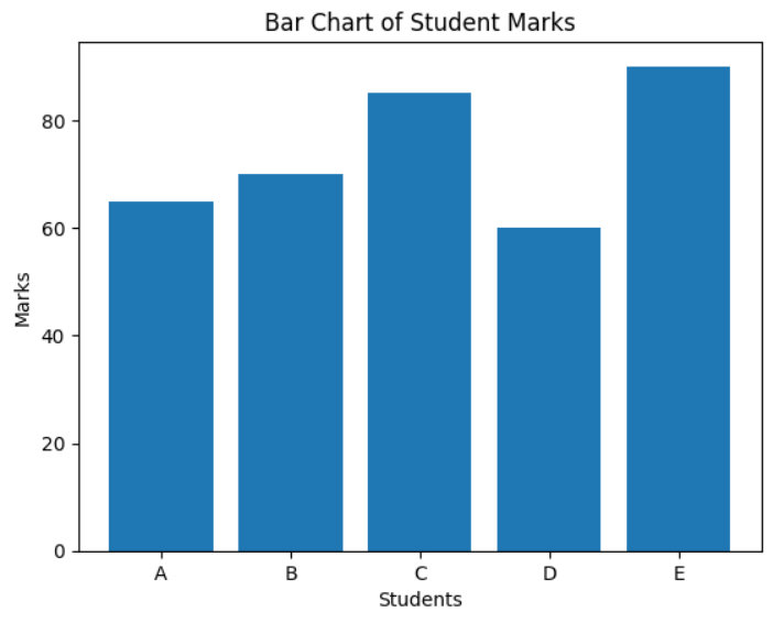
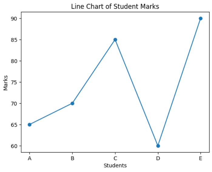
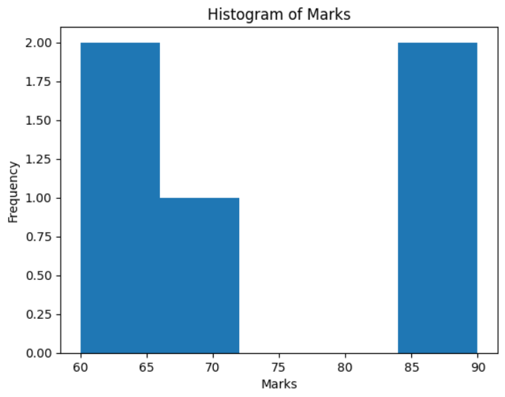
Aim: Visualize a dataset using Matplotlib by plotting a bar chart, line chart, and histogram.
Code/Steps:
- Open Jupyter Notebook and create a new notebook using New → Python 3 Notebook.
- Import the required libraries: Matplotlib and NumPy.
- Create a sample dataset containing student names and their marks.
- Plot a bar chart to compare the marks of different students.
- Plot a line chart to show the trend of marks.
- Plot a histogram to show the frequency distribution of the marks.
- Run the cell using Shift + Enter to display the charts.
import matplotlib.pyplot as plt
import numpy as np
students = ['A', 'B', 'C', 'D', 'E']
marks = [65, 70, 85, 60, 90]
# Bar Chart
plt.bar(students, marks)
plt.xlabel("Students")
plt.ylabel("Marks")
plt.title("Bar Chart of Student Marks")
plt.show()
# Line Chart
plt.plot(students, marks, marker='o')
plt.xlabel("Students")
plt.ylabel("Marks")
plt.title("Line Chart of Student Marks")
plt.show()
# Histogram
plt.hist(marks, bins=5)
plt.xlabel("Marks")
plt.ylabel("Frequency")
plt.title("Histogram of Marks")
plt.show()
Output:
MCQs
- C
- C
- B
Conclusion: The dataset was successfully visualized using Matplotlib by plotting a bar chart, line chart, and histogram.
Practical 05
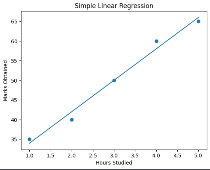
Aim: Implement Simple Linear Regression using scikit-learn on a given dataset.
Code/Steps:
- Open Jupyter Notebook and create a new notebook using New → Python 3 Notebook.
- Import the required libraries: NumPy, Pandas, Matplotlib, and LinearRegression from scikit-learn.
- Create a dataset representing the relationship between hours studied and marks obtained.
- Convert the dataset into a Pandas DataFrame.
- Define the independent variable (X) and dependent variable (y).
- Create a Linear Regression model.
- Train the model using the dataset with the
fit()method. - Predict the marks using the trained model.
- Plot the dataset and regression line using Matplotlib.
- Predict the marks for a new input value (for example, 6 hours of study).
import numpy as np
import pandas as pd
import matplotlib.pyplot as plt
from sklearn.linear_model import LinearRegression
# Create Dataset
data = {
'Hours': [1, 2, 3, 4, 5],
'Marks': [35, 40, 50, 60, 65]
}
df = pd.DataFrame(data)
print(df)
# Independent and Dependent Variables
X = df[['Hours']]
y = df['Marks']
# Create Linear Regression Model
model = LinearRegression()
# Train the Model
model.fit(X, y)
# Predict Marks
predicted_marks = model.predict(X)
print(predicted_marks)
# Visualize Regression Line
plt.scatter(X, y)
plt.plot(X, predicted_marks)
plt.xlabel("Hours Studied")
plt.ylabel("Marks Obtained")
plt.title("Simple Linear Regression")
plt.show()
# Predict for New Data
new_hours = [[6]]
prediction = model.predict(new_hours)
print("Predicted marks for 6 hours:", prediction)Output:
Hours Marks
0 1 35
1 2 40
2 3 50
3 4 60
4 5 65
[34. 42. 50. 58. 66.]
MCQs
- B
- C
- B
Conclusion: Simple Linear Regression was successfully implemented using scikit-learn to predict marks based on study hours.
Practical 06
Aim: Implement Polynomial Regression and compare its results with Linear Regression.
Code/Steps:
- Open Jupyter Notebook and create a new notebook using New → Python 3 Notebook.
- Import the required libraries: NumPy, Pandas, Matplotlib, LinearRegression, PolynomialFeatures, and evaluation metrics from scikit-learn.
- Create a sample dataset representing the relationship between study hours and marks.
- Visualize the dataset using a scatter plot.
- Implement Linear Regression and train the model using the dataset.
- Predict values using the Linear Regression model and evaluate the model using MSE and R² score.
- Transform the dataset using PolynomialFeatures (degree = 2).
- Train the Polynomial Regression model using the transformed dataset.
- Predict values using the Polynomial Regression model and evaluate it using MSE and R² score.
- Plot the polynomial regression curve and compare it with the linear regression results.
import numpy as np
import pandas as pd
import matplotlib.pyplot as plt
from sklearn.linear_model import LinearRegression
from sklearn.preprocessing import PolynomialFeatures
from sklearn.metrics import mean_squared_error, r2_score
# Create Sample Dataset
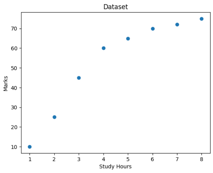
X = np.array([1, 2, 3, 4, 5, 6, 7, 8]).reshape(-1, 1)
y = np.array([10, 25, 45, 60, 65, 70, 72, 75])
# Visualize Dataset
plt.scatter(X, y)
plt.xlabel("Study Hours")
plt.ylabel("Marks")
plt.title("Dataset")
plt.show()
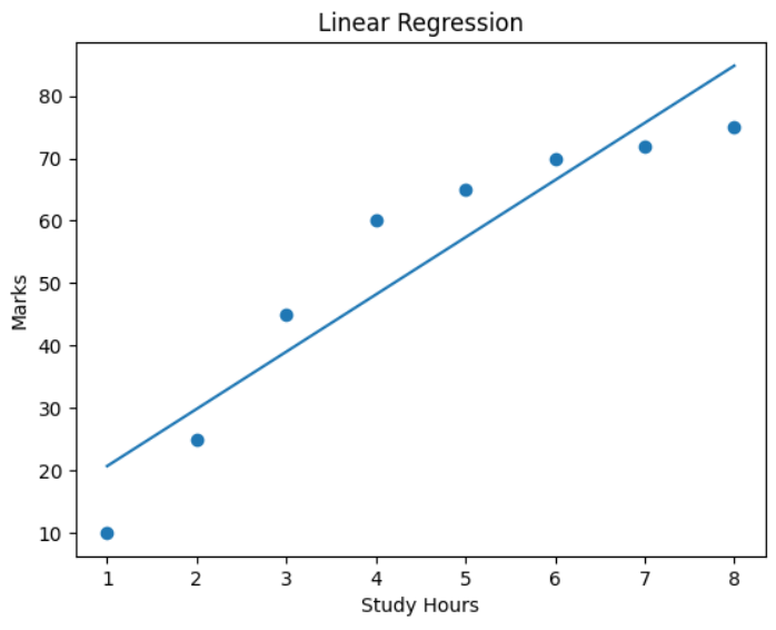
# Linear Regression
linear_model = LinearRegression()
linear_model.fit(X, y)
y_linear_pred = linear_model.predict(X)
# Evaluate Linear Regression
linear_mse = mean_squared_error(y, y_linear_pred)
linear_r2 = r2_score(y, y_linear_pred)
print("Linear Regression MSE:", linear_mse)
print("Linear Regression R2 Score:", linear_r2)
# Plot Linear Regression
plt.scatter(X, y)
plt.plot(X, y_linear_pred)
plt.xlabel("Study Hours")
plt.ylabel("Marks")
plt.title("Linear Regression")
plt.show()
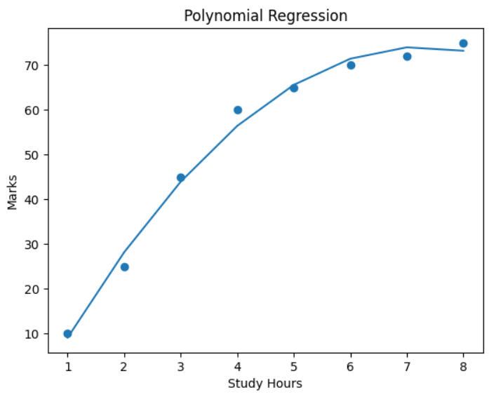
# Polynomial Regression
poly = PolynomialFeatures(degree=2)
X_poly = poly.fit_transform(X)
poly_model = LinearRegression()
poly_model.fit(X_poly, y)
y_poly_pred = poly_model.predict(X_poly)
# Evaluate Polynomial Regression
poly_mse = mean_squared_error(y, y_poly_pred)
poly_r2 = r2_score(y, y_poly_pred)
print("Polynomial Regression MSE:", poly_mse)
print("Polynomial Regression R2 Score:", poly_r2)
# Plot Polynomial Regression
plt.scatter(X, y)
plt.plot(X, y_poly_pred)
plt.xlabel("Study Hours")
plt.ylabel("Marks")
plt.title("Polynomial Regression")
plt.show()Output:
MCQs
- B
- D
- B
Conclusion: Polynomial Regression was implemented and compared with Linear Regression. Polynomial Regression provided a better fit for the dataset when the relationship between variables was non-linear.
Practical 07
Aim: Implement Logistic Regression for a binary classification problem.
Code/Steps:
- Open Jupyter Notebook and create a new notebook using New → Python 3 Notebook.
- Import the required libraries: NumPy, Pandas, train_test_split, LogisticRegression, and evaluation metrics from scikit-learn.
- Create a dataset representing study hours and the result (pass/fail).
- Convert the dataset into a Pandas DataFrame.
- Split the dataset into training and testing sets using
train_test_split(). - Create a Logistic Regression model.
- Train the model using the training dataset with the
fit()method. - Predict the results using the testing dataset.
- Evaluate the model using accuracy score, confusion matrix, and classification report.
import numpy as np
import pandas as pd
from sklearn.model_selection import train_test_split
from sklearn.linear_model import LogisticRegression
from sklearn.metrics import accuracy_score, confusion_matrix, classification_report
# Create Dataset
X = np.array([1,2,3,4,5,6,7,8,9,10]).reshape(-1,1)
y = np.array([0,0,0,0,0,1,1,1,1,1])
data = pd.DataFrame({'Study Hours': X.flatten(), 'Result': y})
print(data)
# Split Dataset
X_train, X_test, y_train, y_test = train_test_split(
X, y, test_size=0.3, random_state=0
)
# Train Logistic Regression Model
model = LogisticRegression()
model.fit(X_train, y_train)
# Make Predictions
y_pred = model.predict(X_test)
print("Predicted values:", y_pred)
print("Actual values:", y_test)
# Evaluate Model
print("Accuracy:", accuracy_score(y_test, y_pred))
print("Confusion Matrix:\n", confusion_matrix(y_test, y_pred))
print("Classification Report:\n", classification_report(y_test, y_pred))Output:
Study Hours Result
0 1 0
1 2 0
2 3 0
3 4 0
4 5 0
5 6 1
6 7 1
7 8 1
8 9 1
9 10 1
Predicted values: [0 1 1]
Actual values: [0 1 0]
Accuracy: 0.6666666666666666
Confusion Matrix:
[[1 1]
[0 1]]
Classification Report:
precision recall f1-score support
0 1.00 0.50 0.67 2
1 0.50 1.00 0.67 1
accuracy 0.67 3
macro avg 0.75 0.75 0.67 3
weighted avg 0.83 0.67 0.67 3MCQs
- C
- C
- C
Conclusion: Logistic Regression was successfully implemented for a binary classification problem and the model performance was evaluated using accuracy, confusion matrix, and classification report.
Practical 08
Aim: Implement the K-Nearest Neighbors (KNN) algorithm for classification and analyze the effect of different values of K.
Code/Steps:
- Open Jupyter Notebook and create a new notebook using New → Python 3 Notebook.
- Import the required libraries: NumPy, Pandas, load_iris dataset, train_test_split, KNeighborsClassifier, and accuracy_score.
- Load the Iris dataset, which is a built-in dataset in scikit-learn.
- Define the features (X) and target labels (y) from the dataset.
- Split the dataset into training and testing sets using
train_test_split(). - Train the KNN classifier with different values of K (for example: 1, 3, 5, 7, 9).
- For each value of K, train the model and calculate the accuracy score.
- Display the accuracy for each K value to analyze how K affects the model performance.
- Finally, use the trained model to predict the class of a new sample.
import numpy as np
import pandas as pd
from sklearn.datasets import load_iris
from sklearn.model_selection import train_test_split
from sklearn.neighbors import KNeighborsClassifier
from sklearn.metrics import accuracy_score
# Load Dataset
data = load_iris()
X = data.data
y = data.target
# Split Dataset
X_train, X_test, y_train, y_test = train_test_split(
X, y, test_size=0.2, random_state=42
)
# Train KNN with Different K Values
k_values = [1, 3, 5, 7, 9]
for k in k_values:
model = KNeighborsClassifier(n_neighbors=k)
model.fit(X_train, y_train)
y_pred = model.predict(X_test)
acc = accuracy_score(y_test, y_pred)
print("K =", k, "Accuracy =", acc)
# Final Prediction Example
model = KNeighborsClassifier(n_neighbors=3)
model.fit(X_train, y_train)
sample = [[5.1, 3.5, 1.4, 0.2]]
prediction = model.predict(sample)
print("Predicted class:", prediction)Output:
K = 1 Accuracy = 1.0
K = 3 Accuracy = 1.0
K = 5 Accuracy = 1.0
K = 7 Accuracy = 0.9666666666666667
K = 9 Accuracy = 1.0
Predicted class: [0]MCQs
- B
- C
- D
Conclusion: The K-Nearest Neighbors algorithm was implemented successfully. The model was trained with different values of K, and the accuracy scores were compared to analyze how the value of K affects classification performance.
Practical 09
Aim: Evaluate a classification model by calculating Accuracy, Precision, Recall, and F1-Score.
Code/Steps:
- Open Jupyter Notebook and create a new notebook using New → Python 3 Notebook.
- Import the required libraries: NumPy, load_iris dataset, train_test_split, KNeighborsClassifier, and evaluation metrics from scikit-learn.
- Load the Iris dataset.
- Define the features (X) and target labels (y).
- Split the dataset into training and testing sets using
train_test_split(). - Train the K-Nearest Neighbors (KNN) model.
- Use the trained model to make predictions on the test dataset.
- Calculate the Confusion Matrix, Accuracy, Precision, Recall, and F1-Score.
import numpy as np
from sklearn.datasets import load_iris
from sklearn.model_selection import train_test_split
from sklearn.neighbors import KNeighborsClassifier
from sklearn.metrics import accuracy_score, precision_score, recall_score, f1_score, confusion_matrix
# Load Dataset
data = load_iris()
X = data.data
y = data.target
# Split Dataset
X_train, X_test, y_train, y_test = train_test_split(
X, y, test_size=0.2, random_state=42
)
# Train Model
model = KNeighborsClassifier(n_neighbors=3)
model.fit(X_train, y_train)
# Make Predictions
y_pred = model.predict(X_test)
# Calculate Metrics
cm = confusion_matrix(y_test, y_pred)
acc = accuracy_score(y_test, y_pred)
prec = precision_score(y_test, y_pred, average='macro')
rec = recall_score(y_test, y_pred, average='macro')
f1 = f1_score(y_test, y_pred, average='macro')
print("Confusion Matrix:\n", cm)
print("Accuracy:", acc)
print("Precision:", prec)
print("Recall:", rec)
print("F1 Score:", f1)Output:
Confusion Matrix:
[[10 0 0]
[ 0 9 0]
[ 0 0 11]]
Accuracy: 1.0
Precision: 1.0
Recall: 1.0
F1 Score: 1.0MCQs
- C
- B
- C
Conclusion: The classification model was successfully evaluated using Accuracy, Precision, Recall, and F1-Score metrics.
Practical 10
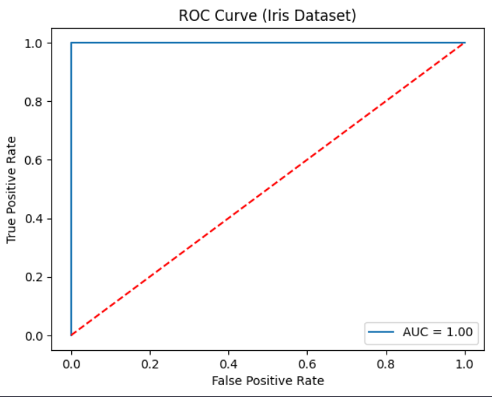
Aim: Plot the ROC curve and calculate the AUC score for a binary classification model.
Code/Steps:
- Open Jupyter Notebook and create a new notebook using New → Python 3 Notebook.
- Import the required libraries: Matplotlib, load_iris dataset, train_test_split, LogisticRegression, and ROC evaluation functions from scikit-learn.
- Load the Iris dataset.
- Convert the dataset into a binary classification problem by selecting one class as positive and others as negative.
- Split the dataset into training and testing sets using
train_test_split(). - Train the Logistic Regression model using the training dataset.
- Predict the probability values for the test dataset using
predict_proba(). - Calculate the False Positive Rate (FPR), True Positive Rate (TPR), and threshold values using
roc_curve(). - Calculate the Area Under Curve (AUC) using
auc(). - Plot the ROC Curve using Matplotlib.
import matplotlib.pyplot as plt
from sklearn.datasets import load_iris
from sklearn.model_selection import train_test_split
from sklearn.linear_model import LogisticRegression
from sklearn.metrics import roc_curve, auc
# Load Dataset
data = load_iris()
X = data.data
y = data.target
# Convert to Binary Classification
y = (y == 2).astype(int)
# Split Dataset
X_train, X_test, y_train, y_test = train_test_split(
X, y, test_size=0.2, random_state=42
)
# Train Model
model = LogisticRegression()
model.fit(X_train, y_train)
# Predict Probability
y_prob = model.predict_proba(X_test)[:,1]
# Calculate ROC and AUC
fpr, tpr, thresholds = roc_curve(y_test, y_prob)
roc_auc = auc(fpr, tpr)
print("AUC Score:", roc_auc)
# Plot ROC Curve
plt.plot(fpr, tpr, label="AUC = %0.2f" % roc_auc)
plt.plot([0,1], [0,1], 'r--')
plt.xlabel("False Positive Rate")
plt.ylabel("True Positive Rate")
plt.title("ROC Curve (Iris Dataset)")
plt.legend()
plt.show()Output:
AUC Score: 1.0
MCQs
- B
- A
- C
Conclusion: The ROC curve was successfully plotted and the AUC score was calculated to evaluate the performance of the binary classification model.
Practical 11
Aim: Apply K-Means clustering on a dataset and visualize the formed cluster
Code/Steps:
import numpy as np
import matplotlib.pyplot as plt
from sklearn.datasets import make_blobs
from sklearn.cluster import KMeans
X, y = make_blobs(
n_samples=300,
n_features=2,
centers=3,
cluster_std=1.0,
random_state=42
)
kMeans = KMeans(
n_clusters=3,
random_state=42,
n_init=10
)
kMeans.fit(X)
labels = kMeans.predict(X)
centroids = kMeans.cluster_centers_
plt.figure()
plt.scatter(X[:, 0], X[:, 1], c=labels)
plt.scatter(centroids[:, 0], centroids[:, 1], marker='x', s=200)
plt.title("KMeans Clustering")
plt.xlabel("Feature 1")
plt.ylabel("Feature 2")
plt.show()Output:
MCQs
- B
- A
- B
Conclusion: In this practical we applied K-mens clustering to group data into different clusters, the algorithm separated the clusters using visualization.
Practical 12
Aim: Perform hierarchical clustering on a dataset and plot the dendogram
Code/Steps:
import numpy as np
import matplotlib.pyplot as plt
from sklearn.datasets import make_blobs
from scipy.cluster.hierarchy import dendrogram, linkage
from sklearn.cluster import AgglomerativeClustering
X, y = make_blobs(
n_samples=200,
n_features=2,
centers=3,
cluster_std=1.0,
random_state=42
)
linked = linkage(X, method="ward")
plt.figure()
dendrogram(linked)
plt.title("Hierarchical Clustering Dendrogram")
plt.xlabel("Data points")
plt.ylabel("Euclidean Distance")
plt.show()
model = AgglomerativeClustering(n_clusters=3, linkage="ward")
labels = model.fit_predict(X)
plt.figure()
plt.scatter(X[:, 0], X[:, 1], c=labels)
plt.title("Hierarchical Clustering Result")
plt.xlabel("Feature 1")
plt.ylabel("Feature 2")
plt.show()Output:
MCQs
- B
- B
- B
- B
Conclusion: In this practical we performed hierarchical clustering and plotted the dendogram. The dendogram helped visualize how data points are grouped step-by-step based on similarity.
Practical 13
Aim: Apply principal Component Analysis for dimensionality reduction on a dataset
Code/Steps:
import numpy as np
import matplotlib.pyplot as plt
from sklearn.datasets import load_iris
from sklearn.preprocessing import StandardScaler
from sklearn.decomposition import PCA
iris = load_iris()
X = iris.data
y = iris.target
scaler = StandardScaler()
X_scaled = scaler.fit_transform(X)
pca = PCA(n_components=2)
X_pca = pca.fit_transform(X_scaled)
print("Explained variance ratio:", pca.explained_variance_ratio_)
print("Total variance retained:", pca.explained_variance_ratio_.sum())
plt.figure()
plt.scatter(X_pca[:, 0], X_pca[:, 1], c=y)
plt.xlabel("Principal Component 1")
plt.ylabel("Principal Component 2")
plt.title("PCA Dimensionality Reduction (Iris Dataset)")
plt.show()Output:
MCQs
- B
- D
- C 4.C
Conclusion: In this practical we applied PCA to reduce the dataset dimensions while retaining maximum variance. The transformed data was visualized using a scatter plot to understand the reduced features clearl.
Practical 14
Aim: Implement a simple Perceptron model or basic Neural Network using scikit-learn or Keras and demonstrate training and prediction
Code/Steps:
import numpy as np
from sklearn.datasets import load_iris
from sklearn.model_selection import train_test_split
from sklearn.preprocessing import StandardScaler
from sklearn.metrics import accuracy_score, classification_report
from sklearn.linear_model import Perceptron
iris = load_iris()
X = iris.data
y = iris.target
y_binary = (y == 0).astype(int)
X_train, X_test, y_train, y_test = train_test_split(
X, y_binary,
test_size=0.3,
random_state=42,
stratify=y_binary
)
scaler = StandardScaler()
X_train_scaled = scaler.fit_transform(X_train)
X_test_scaled = scaler.transform(X_test)
model = Perceptron(max_iter=1000, tol=1e-3, random_state=42)
model.fit(X_train_scaled, y_train)
y_pred = model.predict(X_test_scaled)
accuracy = accuracy_score(y_test, y_pred)
print("Accuracy:", round(accuracy, 2))
print("\nClassification Report:\n")
print(classification_report(y_test, y_pred))Output:
Classification Report:
precision recall f1-score support
0 1.00 1.00 1.00 30
1 1.00 1.00 1.00 15
accuracy 1.00 45
macro avg 1.00 1.00 1.00 45
weighted avg 1.00 1.00 1.00 45
Run completed in 11473.5msMCQs
- B
- C
- C
Conclusion: In this practical we implemented a simple perception model, trained it on dataset and made predictions. The model performace was evaluated very accuracy.